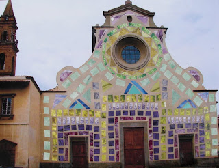
History is unclear about why the facade was never completed. Nevertheless, a few hundred years ago the people in the Santo Spirito community decided to add stucco to the rough stones that now lay beneath. This forms a great template to challenge students with, and I asked them to design a facade. Below are their solutions.
(We do this every year, and this year's are the best so far!)
Early in our stay here we learned tat Sarah Ferguson fell in "love" with gelato, and it is no surprise that she chose it for her design.

Megan Fowler's solution was to do a "tie-dye" front to the church.

Morgan Wilson decorated her facade with patterns of color and added elevated "enter" and "exit" signs.
(She also "trade marked" her signature as you can see an encircled R beside her name.)
Bright, cheerful, geometric patters appealed to Melloney Dunlap.

Shanshan Ai decided to add a traditional motif in black and white following the curves of the facade.

Daniel Holt reached back to the Eastern countries with this cartoon look exhibiting great perspective qualities.

Another monochromatic design was developed by Sara Brannen. She filled the facade with lots of Renaissance symbols and deigns decorations.

Britynn Davis has seen lots of mosaics while in Florence, and she constructed her design using a pattern of mosaic tiles.

Obviously, Abby Ganong was influenced with the new Florentine tradition where lovers lock their symbolic padlocks to the Ponte Vecchio and throw the keys in the Arno River to prove that their love will always endure. So here is a lock and two kissing giraffes.

Allison Brewer created a bit of starry night with geometric forms to tie her design together.
 History is unclear about why the facade was never completed. Nevertheless, a few hundred years ago the people in the Santo Spirito community decided to add stucco to the rough stones that now lay beneath. This forms a great template to challenge students with, and I asked them to design a facade. Below are their solutions. (We do this every year, and this year's are the best so far!)
 Early in our stay here we learned tat Sarah Ferguson fell in "love" with gelato, and it is no surprise that she chose it for her design.
 Megan Fowler's solution was to do a "tie-dye" front to the church.
 Morgan Wilson decorated her facade with patterns of color and added elevated "enter" and "exit" signs. (She also "trade marked" her signature as you can see an encircled R beside her name.)
 Bright, cheerful, geometric patters appealed to Melloney Dunlap.
 Shanshan Ai decided to add a traditional motif in black and white following the curves of the facade.
 Daniel Holt reached back to the Eastern countries with this cartoon look exhibiting great perspective qualities.
 Another monochromatic design was developed by Sara Brannen. She filled the facade with lots of Renaissance symbols and deigns decorations.
 Britynn Davis has seen lots of mosaics while in Florence, and she constructed her design using a pattern of mosaic tiles.
 Obviously, Abby Ganong was influenced with the new Florentine tradition where lovers lock their symbolic padlocks to the Ponte Vecchio and throw the keys in the Arno River to prove that their love will always endure. So here is a lock and two kissing giraffes.
 Allison Brewer created a bit of starry night with geometric forms to tie her design together.

No comments:
Post a Comment